Let's do some comparisons today. We'll look at good vs. bad, and I'm not only talking about the quality of the cake. I'm also addressing the way it's presented and how the photograph was taken.
Let's begin!
The good:
The bad and ugly:


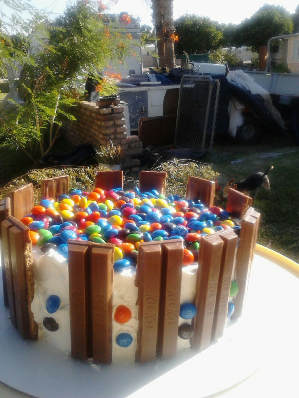
Now what are the differences? I'm sure you can tell, but I'll point them out anyway. The first picture has a beautiful background which is out of focus to bring the subject (the cake) into the light, the lighting is perfect and natural, and the cake itself is very well done.
The second picture's background features a junk pile and a dog, the lighting, although natural, is harsh and unbalanced, and the cake itself is fit for a family barbecue (which isn't bad, but if it's for sale, which this one was, it shouldn't look like this).
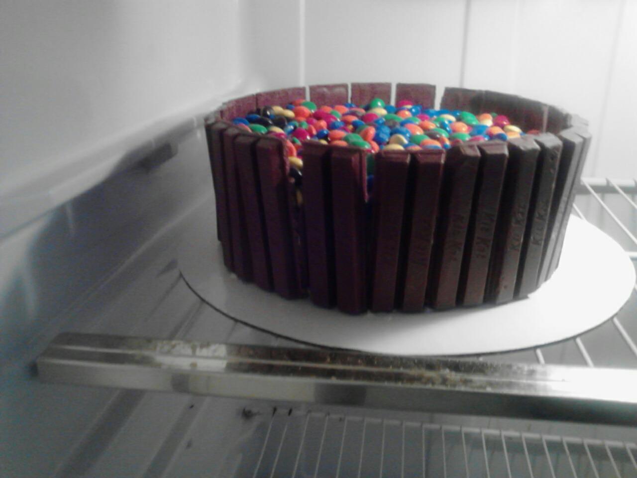
The third's "background" is a fridge, using the fridge light, and the cake isn't centered in the picture nor on the cake board.
The amazing:
The sad:

I'm not even going to go into what's wrong with the second cake. My focus is on the pictures, so I'm going to try my best to ignore the cake.
So the first cake is amazing. Seriously. Lighting, background, just everything. The second is not so much. There is junk all over the table, the flash made the shadows and highlights really harsh, the cake is sitting on a plate and not a cake board, and there's food coloring and scraps everywhere.
One last bad picture:

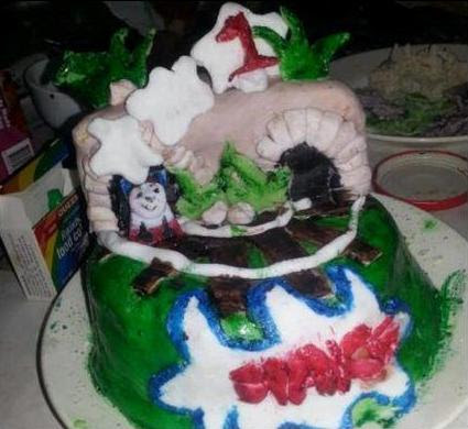
I don't know what this person was trying to show their customers/fans, but this just...
Extremely blurry, fondant thingies on a Ziplock lid, and the fondant thingies aren't even displayed nicely. They're just scattered across the lid all haphazard and whatnot. Not the way to display your work.
If you're taking pictures of your work, either take the time to go and take some beginner photography classes, or watch/read up on online tutorials. Even the smallest changes can improve your pictures, and the better your pictures, the better your business.


No comments:
Post a Comment